
COVID Alert is now retired: For more information, visit the Government of Canada COVID Alert home page.
The COVID Alert app is the public-facing component of the exposure notification service. It was designed to notify people when they have been near someone who has been diagnosed with COVID-19 who is also using the app. It then encourages them to take the appropriate next steps (e.g. get tested or stay home and monitor symptoms). This means the app is mostly passive. Its main functionality is to provide users with the ability to report a positive test by entering a one-time key. Doing so activates sending exposure notifications to others.
App research
To develop COVID Alert with the needs of users in mind, we conducted mixed methods design research at each phase of the development process. This work sought to inform the design of the service within the constraints of the framework in which it was developed.
App discovery and secondary research
To begin, we conducted discovery research activities to:
- Learn from existing work on contact tracing and exposure notifications from around the world with Canadian residents’ context in mind;
- Understand the way the COVID Alert app would function in the Canadian context (e.g. the need for both English and French and to serve diverse communities);
- Identify usability and other issues that may arise and address them early on while creating the app.
Methodology:
In order to understand the way the COVID Alert app would work in the Canadian context, we conducted a diverse set of discovery research activities.
- Contextual research – to understand how COVID Alert apps in other countries were received.
- Survey on needs and attitudes – to understand how the public might receive the app and their needs for it.
- Secondary research – to learn from existing global COVID Alert apps to determine barriers as way to address them while designing the app.
- User journey map – to identify research area opportunities to study as the app is developed.
When: June 2020 to January 2021
Learnings:
- We identified areas to look into for the app in the Canadian context.
- We developed four mindsets to understand the user groups we encountered. We found that most respondents to our survey and in the secondary research were in one of four mindsets: cautious, helpful, reluctant, or cooperative. The team used those mindsets for communications and design work.
Related blogs:
- Meeting the needs of healthcare authorities to roll out COVID Alert across Canada
- Understanding and designing for changing mindsets during a global pandemic
Examining the usability of app functionality
To improve the usability of the app, we conducted usability studies throughout the development process. The studies built on each other and followed the key feature development of the app.
Methodology: Usability testing, one-to-one sessions
During each usability study, we asked participants to test a prototype of the app and share their reflections during an online usability study.
- Study I: Receiving notification feature | Participants: 8
- Study II: Understanding exposure state | Participants: 5
- Study III: Turn on and off test feature | Participants: 7
When: June 2020 – April 2021
Learnings:
The functionality of the framework and how the app shares data and protects privacy is complicated. Through multiple rounds of usability testing, we sought to improve the onboarding experience of new users, they way they received exposure notifications, and entered one-time keys in intuitive ways.
- Usability testing revealed that the initial onboarding experience was long and participants became fatigued. The flow was shortened and the explanation was simplified through the use of visual storytelling.
- In a test of the exposure notifications, participants were able to identify what time range constituted an exposure and would trigger an exposure notification (Study III). However, there were several points of uncertainty about the exposure notifications they received. These included, the location of the exposure notification within the app (Study II), whether the app could record multiple exposures (Study I), and what the different notifications in the app meant. The content and UI were updated to improve clarity.
- There seemed to be a tradeoff between privacy and the information value of exposure notifications. The notifications were written to protect privacy which is important for users but the inexact information of the notification presented some difficulties. Participants had difficulty remembering the number of people they had been near for a total of 15 minutes and had questions around the consequences of an exposure to someone with COVID-19 if it lasted less than 15 minutes. Several study participants wanted to know the exact dates of exposure.
Testing the app before launch
Before the public release of COVID Alert, we conducted two beta studies to test the functionality on different devices and platforms and collect user feedback to ensure that the app performed well in different contexts.
Methodology: Two beta studies
- Small-scale beta study | Participants: 33
- CDS’s friends and family participated in a small-scale beta study.
- Participants downloaded the app and tried out scenarios defined by the team.
- We tested the processes of (1) entering a one-time key feature as if they had a positive diagnosis (2) sending a notification based on the keys entered and the potential exposures that took place and (3) receiving an exposure notification.
- Large-scale beta study | Participants: 5,054 Testing in Beta for Android and Apple phones Android – 1931 Apple – 3123
- We invited people from the general public using social media avenues to participate in this beta study. The goal was to validate findings from the small-scale beta study, identify common themes, remove bias from the findings, and fix technical bugs before launch. Participants used the app as they would after launch.
When: July 2020
Learnings:
The beta tests revealed usability and technical issues that were addressed before app launch.
- Participants noted that the notification was not visible for long enough. One person said, “the notification flashed on my phone but it disappeared quickly and I really didn’t get to read it all.”
- Participants assumed that they would get an automatic notification even when there is no exposure.
- The logging function required upgrades after users noted that the logs were not updating when the app was running in the background.
- It was critical to have codes prompt during waking hours to avoid disturbing people’s sleep.
- The app had layout issues on some older Android devices. These technical issues were resolved pre-launch.
Understanding the user experience of the live app
In addition to ongoing usability testing, we conducted surveys of the users and conducted an analysis of reviews posted to the Apple and Google Play stores to understand the user experience of the live service. For our research, we reached out to members of the public through social media to create a research panel. These panel participants were invited to participate in our surveys as well as usability testing.
Methodology: Survey and an analysis of App Store reviews
When: October 2020
Participants: 1331
Learnings:
Survey research and research on app reviews revealed the perceived benefits, perceived risks, and some of the misconceptions related to the app.
- Reported benefit for using the app was to “help” be a part of the effort for “contact tracing”. Most respondents saw using the app as a way to increase personal safety and the safety for those close to them. It was part of their civic responsibilities.
- Many respondents report anxiety and worry during these times. For a couple of people, the app in fact decreases “nervousness” about going out. “Knowing if I’ve been in contact with a COVID-positive person gives me peace of mind.“
- Respondents liked that the app is non-intrusive and simple to use. The most commonly reported advantage of the app is that it is “non-intrusive” and works in the “background.”
- The perceived risks in using the app were generally related to perceived privacy or security issues. Some Canadian residents cited a profound distrust of the technology companies involved in building the framework and/or the federal government. They believed the app would track them and report on them.
- One persistent misconception about the app was that it provided immediate information or protection from exposure. Some survey respondents thought that they could check for exposures immediately after interacting with people (e.g. going to a grocery store). One person said: “I check when I have been out of my home for grocery shopping or other errands. I just look to see if I have been exposed.” Content updates attempted to clarify this area of confusion.
App design
We designed the app in a human-centred way, by focusing on people’s needs and contexts. We kept in mind that people would probably be scared and stressed when they received an exposure notification. Some of them could be very sick when they received a diagnosis, possibly the sickest they had ever been, or they could be imagining becoming the sickest they have ever been.
This section highlights the guidelines and principles we followed, the processes we used to design the app, and some design artifacts.
Guidelines and principles
Content design
The key to a successful exposure notification service was that people trusted it. From a content design perspective, this meant people needed to understand what the service did.
Overarching principles
- Inform just in time. Don’t rely on people’s memory. Instead, give them information when they need it, not before.
- Give just enough detail. Don’t explain everything. Focus on what’s necessary to avoid information overload and to keep screens at a manageable length.
- Spread out density of meaning. Complex concepts increase the cognitive load since there’s a lot to unpack in just a few words. To help people understand something complex, provide information gradually.
- Write like a real human. Use a voice that is caring but not too familiar, and not condescending.
Related blog post: Just enough detail: how we designed content for the COVID Alert app
Writing standards
We also developed more granular content standards focused on readability and empathy. This is not an exhaustive list:
- Use COVID-19 every time. Do not shorten to COVID (except for the service name).
- Use “guidance” instead of “advice” to indicate that it should be followed.
- Use “app” instead of “application”.
- Don’t use diagnoses in a plural format. Instead rewrite to use diagnosis singular.
- Use “healthcare” when it’s modifying a noun (like “workers”) instead of “health care.”
- Use “share exposures” instead of “upload codes” in screens that precede an OS permission dialogue. It’s consistent with Apple and Google pop-ups over which we have no control.
- Don’t use “see” as a verb for learning more. Not everyone who will use the app can see. Instead, use “read” or “learn more.”
- Use “we” sparingly to avoid suggesting that people are watching. Use “the app,” “COVID Alert” or “it” any time you can and make sure the antecedent for “it” is clear.
- The users are the people who help limit the spread, not the app. Give credit where it’s due.
- Front load headings to put the most meaningful words first.
- Avoid acronyms.
- Use sentence case.
- Do not use negative contractions.
- End each element of a list with a period to make it better for immersive readers.
- Capitalize each element of a list.
- Use Oxford commas.
Interaction design
COVID Alert was initially designed as a passive app. This means a user shouldn’t have to use it regularly to benefit from it, in fact having to use the app less is typically a good thing. The user experience of the app was designed to emphasize this by allowing two types of app interactions: status and controls.
App status
The app status exists on the home screen of COVID Alert in 4 states: exposed, unexposed, unknown, and diagnosed. It tells people if the app detected anything about an exposure. Most times, people can confirm that the app has not detected any exposure: this is the unexposed state. The app will also tell people if it has detected an exposure: this is the exposed state. Other times, the user may have turned the app off, or turned bluetooth off. In such a case, the app cannot work properly and check for exposures: this is the unknown state. At last, when a user is diagnosed and has shared their exposures, the app will enter in a pseudo state called the diagnosed state. It is a pseudo state because the app still looks for new exposures while you are diagnosed. Therefore, if you are exposed and diagnosed, the app will only show the exposed state.
To recap, there are four possible states:
- unexposed;
- exposed;
- unknown;
- diagnosed.
App controls
The controls are the more concrete actions people can take. A few different types of actions exist. The setting type is used to be set once, like the language and current province. Other actions are more performative and change the way the app functions. We call them actions. Turning off the app is one example, where the user chooses to not let the app detect exposures. Entering a one-time key is another action that lets people report their positive diagnosis. All actions usually influence how the COVID Alert app is able to detect exposures for users.
To recap, there are two ways to control the app’s functionality:
- through settings and
- through actions.
If we look at the app home screen, the interface is clearly divided in two sections:
- A main section with the app status, using a symbol, a colour and text that explain the current status. Sometimes, action shortcuts can be accessible on the home screen. This visually occupies around 80% of the screen height and is scrollable if the content is longer than what can fit.
- A shorter bottom section fixed to the bottom of the screen that provides access to all settings and actions.
App iconography
Iconography plays a role in the user experience to provide affordance in relation with the app status. In addition to the symbols themselves, a colour and shape reinforces the four possible states of the app. Unexposed being green, exposed being purple, unknown being red, and diagnosed being a light gray.
We avoid icons like the map pin, the GPS point, and GPS waves, which are collectively associated with intrusive concepts such as location, tracking, and position. Instead, we translated the app status into human language by using hand gestures and symbols.
Accessibility
We made sure accessibility was accounted for in the Figma components we used to compose screens. In addition, we used an accessibility checklist for interaction design, at any step of the feature development process.
Accessibility checklist for interaction design
Illustrations
We created illustrations that would allow everyone to feel like they were included in the fight against COVID-19. We wanted designs that were low burdening, accessible on a variety of mobile devices, and understood by as many people as possible. Thus the following principles guided the illustrating process:
- Create clear mobile-friendly concepts. Use thick enough drawing lines to display concepts on smaller screens, but still allow room for important details. Validate concepts to avoid possible misinterpretations. Use a minimal colour palette to reduce confusion and allow the eye to adapt to each screen.
- Reflect diverse populations within Canada. Show diversity beyond hair – use clothing, items, movement, and accessories to illustrate diversity. Don’t give pigmentation to lighter-skin characters in order to give equal contrast and tone to all characters featured on a screen.
- Use visual storytelling. While some people rely on the act of reading to ensure they follow instructions properly, a lot of people learn through visuals, and not language. To be inclusive, use both.
Related blog post: Illustrating with diversity and inclusion for the COVID Alert app
Inclusive design process
We used a consistent high-level workflow where we collaborated with researchers and developers, and we also had other recurring reviews. Our design process was not only inclusive in terms of input from other disciplines, but it also helped ensure we were designing something inclusive and accessible for everybody.
High-level workflow
- Do subject matter research
To design or improve app features, we relied on subject matter research because we are not experts in public health. We used publicly available guidance from federal and provincial health authorities to help us understand the problem space, and we also engaged with public health experts to inform our rationale and decisions.
- Design and validate app feature
We used Figma to design the app. To approach the design of new features, we used user flows. This allowed us to have a better idea about the complexity of the task. This is also where we would engage with the developers to better define the design and get validation on feasibility. Then we proceeded to mock up the screens.
- Iterate
The first design iterations often happened after one of the recurring reviews with other designers, team members or stakeholders.
- Test with real people
We created Figma prototypes for the features we designed, which could then be tested with participants during research sessions.
- Iterate
Following the research sessions, we would often iterate our designs to implement the researchers’ recommendations.
- Validate with partners
Once a design was completed, the product manager would validate it with the stakeholders.
- Handoff to developers
Once the design was validated, we would hand it off to the developers during a meeting where we walked through the design together. This was also an opportunity for them to catch any possible implementation challenge, and for us to adjust. After the handoff, we would consider the screens frozen as they get implemented.
- Design review of test builds
The last step of the design process was to review the designs on a test build of the app. We checked for issues related to spacing, alignment, padding, scrolling, magnifying, copy, links, etc.
Recurring reviews
While they’re not outlined in the high-level design process, we participated in other reviews to help us design the app with inclusion and accessibility in mind.
Design reviews
Design reviews included interaction designers, service designers, content designers, and accessibility experts from different parts of the exposure notification service. They were invited to share work in progress and design challenges. This allowed us to explore more possible design ideas, detect issues, and make the design process more inclusive.
Content critiques
Content critiques happen daily amongst content designers at CDS, and are meant to get constructive feedback from peers on work in progress. The scope of the work brought to critique varies, but can include specific screens, entire flows, high-level information architecture, etc. Every week, pieces of work were brought to content critique to help improve the app.
Shareback with stakeholders
At the end of every sprint, we shared our work with stakeholders and the wider team. This was an opportunity to get feedback and hear good questions from public health stakeholders and team members.
Accessibility reviews
We conducted accessibility reviews especially early in the process, to get us into a good place. Afterwards, accessibility continued to be assessed during QA testing.
App design artifacts
Onboarding user flow
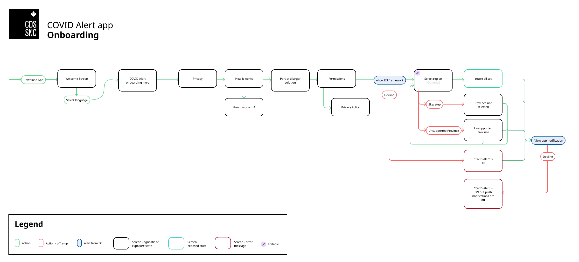
This user flow represents the COVID Alert app onboarding.
After a user has downloaded the app, a welcome screen makes them select a language (English or French). The user is then presented with a series of screens explaining what the app is and how it works.
The app then asks permission to turn on the exposure notification framework. If the user allows it, they can select their province or territory. If they don’t allow it, the app will let them know COVID Alert is OFF.
After choosing their region, the user is all set and their device will ask them to turn on notifications for COVID Alert. If they decline, the app will be ON, but notifications will be OFF. If the user prefers not to choose any province or territory, or if their region is not supported yet, the homescreen will let them know, but the app will be working.
Menu navigation
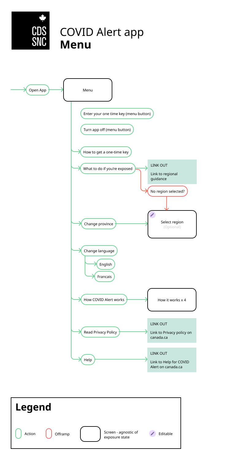
This flow represents the menu of the COVID Alert app.
From the menu, a user can:
- enter a one-time key;
- turn the app OFF;
- learn more about how to get a one-time key;
- learn what to do if they’re exposed;
- change their province or territory, change the app language (English or French);
- learn more about how the app works;
- read the privacy policy on the canada.ca website;
- get help for COVID alert on the canada.ca website.
Detecting an exposure
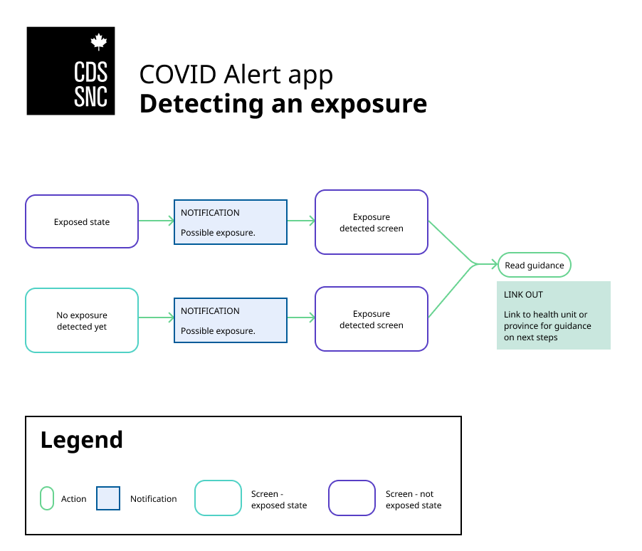
This flow represents the detection of exposures by the COVID Alert app.
If the home screen of a user is in a “not exposed” state, and the user receives an exposure notification, their home screen turns into an “exposed” state and links to the public health guidance of their region.
If the home screen of a user is in an “exposed” state, and the user receives an exposure notification, their home screen stays in an “exposed” state which links to the public health guidance of their region.
Entering a one-time key into the app
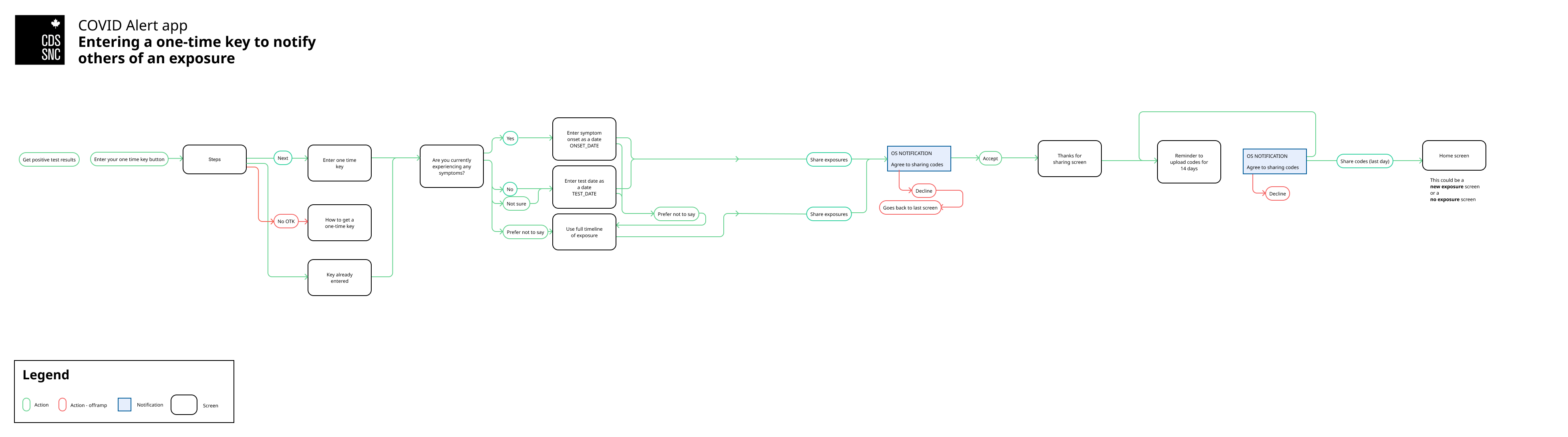
This user flow represents the process of entering a one-time key into the COVID Alert app to notify others of an exposure.
After a person has received their positive test result, they can tap “Enter your one-time key” in the menu. They land on a screen that explains all the steps that will follow. They can tap next to a screen where they enter the one-time key they received, or they can tap on a button saying they don’t have a one-time key. In that case, the next screen tells them how to get a one-time key.
Then, the user taps to share their exposures. They receive a notification from their device asking if they agree to sharing codes. If they decline, they go back to the previous screen. If they accept, they get a thank you screen.
For the following 13 days, they will receive a daily notification reminding them to share their exposures. On the last day of code sharing, their home screen will either be in a not exposed state, or in a new exposed state.
App technical overview
The COVID Alert app is a React Native client application, forked from the CovidShield mobile application originally developed by volunteers outside of the Canadian Digital Service. It is an implementation of Apple/Google’s Exposure Notification framework, informed by the guidance provided by Canada’s federal and provincial privacy commissioners and designed to protect users’ privacy.
It works alongside the server and portal to notify people in Canada if they have been near someone who has been diagnosed with COVID-19 and is also using the app. Detailed technical documentation was created throughout the development process in the covid-alert-documentation GitHub repository. The app performs the following functions:
- Exposure checks: The app checks for potential exposures multiple times a day (roughly every four hours) by downloading a list of exposed random IDs to see if they match the codes kept securely on a device. If codes match, a user’s device will determine if they’ve been in contact for 15 minutes or more within a two meter distance over a 24 hour period, in which case they will get an exposure notification.
- Background tasks: In line with most apps, the app uses “background tasks” as a way for the app to keep content up to date and for the app to function in the background of your phone. For example, when you are using another app or have the app minimized. These background tasks are normal functions of your app interacting with your phone’s operating system.
- Uploading one-time keys: Users of the app can opt in to share one-time key – A unique code distributed by someone’s local health authority if they are diagnosed with COVID-19 – which allows other users of the app to know if they’ve been near them.
- Configuration updates: The app downloads configuration files from the server which allows settings and other data to be updated without the need to release a new version of the app.
- Pull notifications: Information or updates that the end user or intermediary software requests from the backend of an application.
Source code repository
The app code is managed in the covid-alert-app GitHub repository.
Read the app README file to know more about how to build and run the app.
Technology stack
Third-party tools used:
- Fastlane is an open source platform aimed at simplifying Android and iOS deployment;
- BackgroundFetch is a plugin which attempts to awaken an app in the background about every 15 minutes, providing a short period of background running-time;
- Objective-C is a general-purpose, object-oriented programming language that adds Smalltalk-style messaging to the C programming language and is used for developing parts of the app for iOS;
- Kotlin is a cross-platform, statically typed, general-purpose programming language with type inference and is used for developing parts of the app for Android;
- React Native is used to develop applications for Android, Android TV, iOS, macOS, tvOS, Web, Windows, and UWP by enabling developers to use the React framework along with native platform capabilities;
- GAEN framework;
- COVID Alert Server is an application that works with the app to deliver parts of the COVID Alert service;
Privacy
- COVID Alert is designed to provide exposure notifications while protecting the privacy of individuals using the app. COVID Alert’s development was informed by the joint privacy principles published by Federal, Provincial and Territorial Privacy Commissioners, and by the shared privacy principles for contact tracing apps published jointly by the University of Calgary, the University of Waterloo, Ryerson University, the University of New Brunswick, and Concordia University.
- To safeguard the confidentiality and privacy of all Canadians, COVID Alert uses strong measures to protect any data it collects, and does not track a user’s location or collect personally identifiable information. The Privacy Commissioners of Canada and Ontario were consulted on the development of COVID Alert. The federal Office of the Privacy Commissioner’s review of COVID Alert is available to read online.
- COVID Alert’s Privacy Notice and complete Privacy Assessment are both available to read. CDS worked closely with Health Canada’s Privacy Management Division throughout the design, development, and continued operation of the app.
GAEN framework
- The GAEN framework is a privacy-preserving framework designed to enable exposure notifications to be sent without being linkable back to individual users or devices. More documentation on the GAEN framework is available from Apple and available from Google.
- API Framework Version – COVID Alert continues to use V1 of the API. Code for using V2 has been included in the app, but is feature-flagged, and is not being used.
Supported operating systems
On iOS
- iOS 13.5+ – Supported
- iOS 12.5+ – Supported
- iOS 13.0.x – 13.4.x – Not supported
On Android
- Android 6.0+ – supported;
- Android 5 – Not supported. While GAEN is supported by Google on Android 5, COVID Alert does not support Android 5;
- Samsung devices – Some Samsung devices, as well as some other unknown devices may not support GAEN, because of manufacturer specific settings to optimize battery performance. There is no definitive list of affected devices.
Metrics
COVID Alert’s metrics implementation followed the privacy approach outlined here, developed with Health Canada’s Privacy Management Division and through engagement with the Office of the Privacy Commissioner. These in-app metrics were introduced in February 2021. Metrics were collected by:
- publishing a metric via the metrics service implemented in the application;
- applying a filter on the metric publication to see if we really want to finalize the operation (we didn’t necessarily want to publish a metric “application startup” several times a day);
- recording the metric in a database or sending it directly to the server;
- collecting everything in the database to send a packet of metrics to the server every X number of hours, using a metrics sending system.
You can learn more about the implementation of metrics on the server side.
QA testing
Regression testing
Prior to a release build being moved to production, a pre-release checklist had to be completed to capture QA validation of the candidate build. The following items were the minimum testing requirements needed to ensure the app is functioning correctly:
- installation and onboarding – Android and iOS (English and French);
- confirmation that all menu items are accessible – Android and iOS;
- validation of copy for entire app (spelling/alignment);
- timed exposure test for proximity – Android and iOS;
- background task exposure check – Android (should occur approximately every 20 minutes);
- background task exposure check – iOS (should occur approximately every 4 hours);
- stop/start test (turn Alert off/on);
- clearing of exposure checks – Negative test;
- guidance of users to complete OTK sharing;
- confirmation that the app doesn’t break Google Work Profile screen;
- navigation to Guidance links.
Accessibility testing
Mobile accessibility, in our case, defined how to make app content more accessible to people with disabilities while they use their mobile devices. In order to ensure the accessibility navigation for the COVID Alert app, testing for this would need to focus on:
- screen reading via TalkBack (Android) and VoiceOver (iOS);
- font (size/style) – Android and iOS;
- magnification – Android and iOS.
App support
To encourage people to keep using the app, we set up a support system to answer questions, correct misinformation, respond to reviews, and troubleshoot technical issues. The support team also shared feedback to the app team about potential bugs, feature requests, and usability issues.
Principles
- We are kind and empathetic. We acknowledge people’s experience(s) and situation(s) as they describe them.
- We provide good information that’s easy to understand. We understand that people are likely under stress and may struggle to understand instructions – especially if they have just been diagnosed with COVID-19.
- We do not give health advice. We always defer to the local public health authority.
How we responded to support requests
The COVID Alert Help Page on Canada.ca provided information to help people find answers to their questions. People who required further assistance could contact us.
- Health Canada responded to email support requests using canned responses from the COVID Alert Support Question and Answers. They forwarded all other requests to CDS.
- Service Canada responded to support requests through the COVID-19 Information Line using canned responses from the COVID Alert Support Question and Answers. They forwarded all other requests to CDS.
- CDS Support Team responded to support requests forwarded from Health Canada and Service Canada, as well as those made through the Apple App Store, Google Play Store, and CDS’s Twitter accounts (@CDS_GC and @SNC_GC). Agents responded independently and collaboratively.
- CDS Super Tech Support Team met each day for 15 minutes to solve particularly challenging technical issues. The Super Tech Support Team included support agents, developers, and product managers. In some cases, the team also consulted with Google and Apple to solve issues.
How we prioritized support requests
- Problem entering a one-time key. Rationale: one-time keys expire in 24 hours and cannot be reissued. So if someone has problems entering their key, it could have public health consequences. Urgent priority, respond immediately.
- App not working. Rationale: if the app isn’t working, it could have public health consequences. High priority, respond within a business day.
- App working but not performing as expected. Rationale: if people don’t have a good experience using the app, they may choose to uninstall it and make the app less effective as a public health tool. High priority, respond within two business days.
- Question or misinformation about the app. Rationale: if people don’t trust the app or understand how it works, they may choose not to download it or to uninstall it. This will make the app less effective as a public health tool. Medium priority, respond within two business days.
- Feature request. Rationale: people who have a good experience using the app will continue to use the app and encourage others to do so. This will help make the app more effective as a public health tool. Low priority, respond within five business days.
- Review. Rationale: responding to reviews builds trust, and data shows that people are more likely to upgrade their rating when we respond. Low priority, respond within five business days.
How we identified trends
CDS used FreshDesk to manage the ticket workflow. Like many ticketing services, FreshDesk allowed us to tag each ticket according to type, theme(s), and source. This allowed us to see patterns and refer bugs, usability issues, and feature requests to the app team. We used ticket volume, language, and source trends to plan staffing and identify new Questions and Answers for the master list.
Types of tickets
- Problem – something about the app isn’t working for them and they want a solution
- Question – they have a question about the app or how it works
- Feature Request – they have a function they would like to add to the app
- Review – they are sharing their app experience with other users and the team
Thematic tags
- Sentiment – overall, was the sentiment positive, negative, or neutral.
- Frequent issues or questions (gaps in exposure logs, how to tell app notifications from phone notifications, if they received unexpected exposure notification, if they didn’t get an exposure notification they were expecting, definition of an exposure).
- Specific feature requests (time stamp on the exposure notification, clear exposed state after a negative test result, turn off COVID Alert).
- Suspected bugs were tagged and tracked. This allowed us to follow up with specific users when fixes were found or released.
Sources
- Health Canada via alertecovidalert@hc-sc.gc.ca
- Service Canada callbacks from the COVID-19 Information Line (1-833-784-4397)
- CDS Twitter account (@CDS_GC and @SNC_GC)
- COVID Alert on the Google Play Store
- COVID Alert on the Apple App Store